Home
Home news, tips and advice from quirky stories to the best advice on mortgages, energy bills and more.
Home news, tips and advice from quirky stories to the best advice on mortgages, energy bills and more.
Home news, tips and advice from quirky stories to the best advice on mortgages, energy bills and more.

Brits have been warned about the ban while the nation swelters in yet another lengthy heatwave
The mercury is set to rise exponentially this week
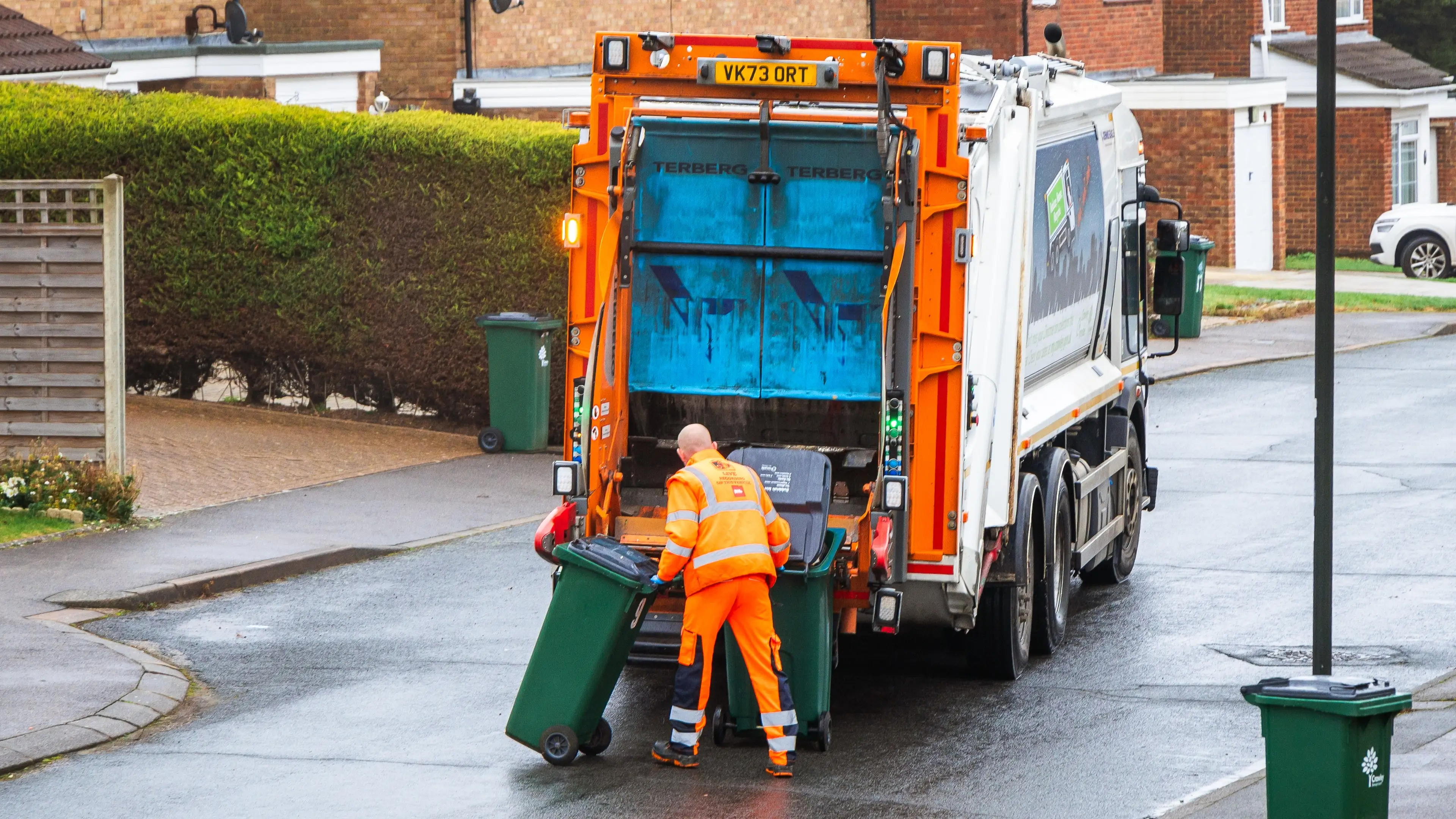
The initiative aims to support drivers and have a positive impact on the environment
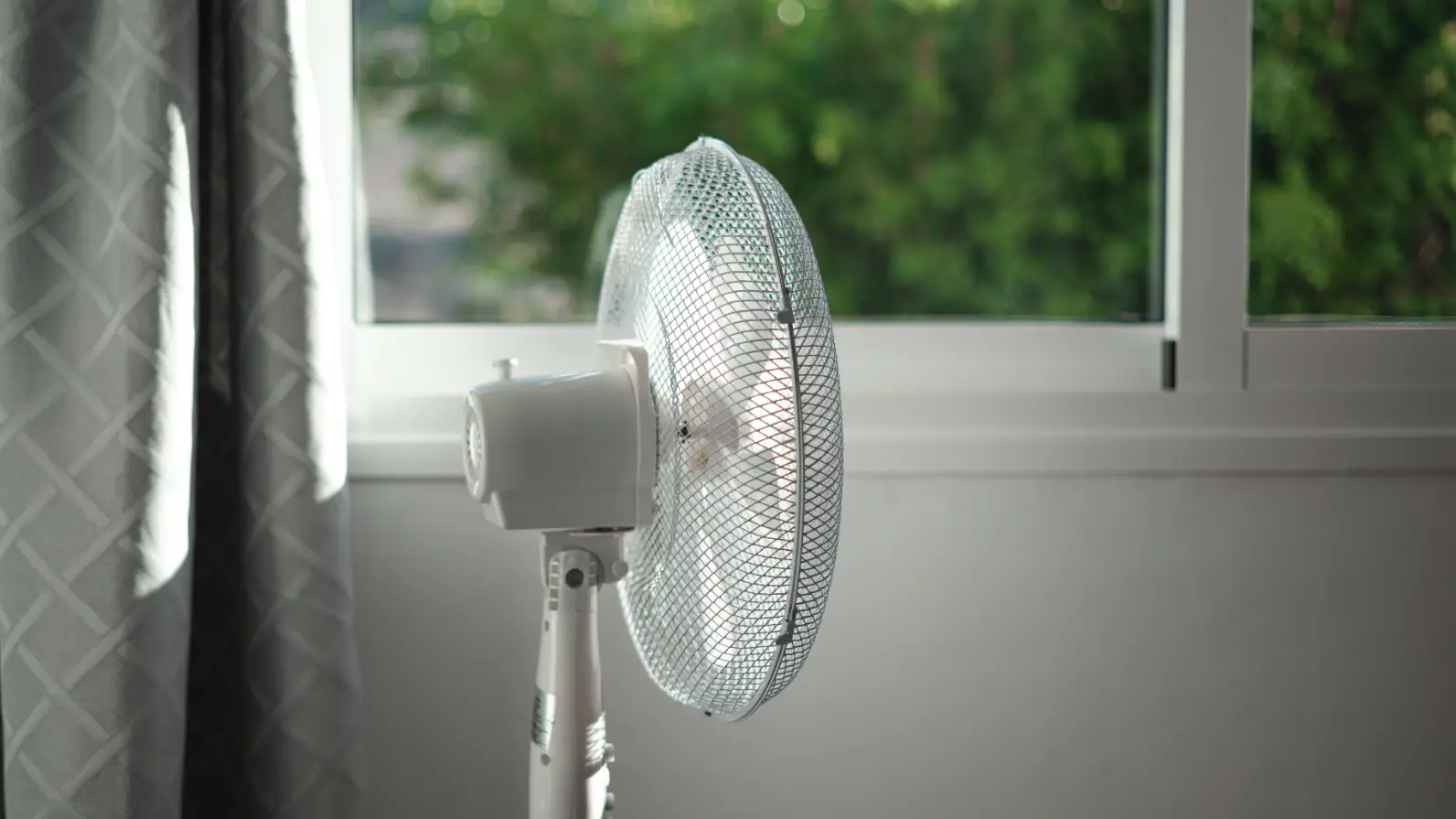
Medical experts have warned against sleeping with a fan on as temperatures soar across the UK during the Bank Holiday long weekend

A genius way to make your flat feel like home on a budget
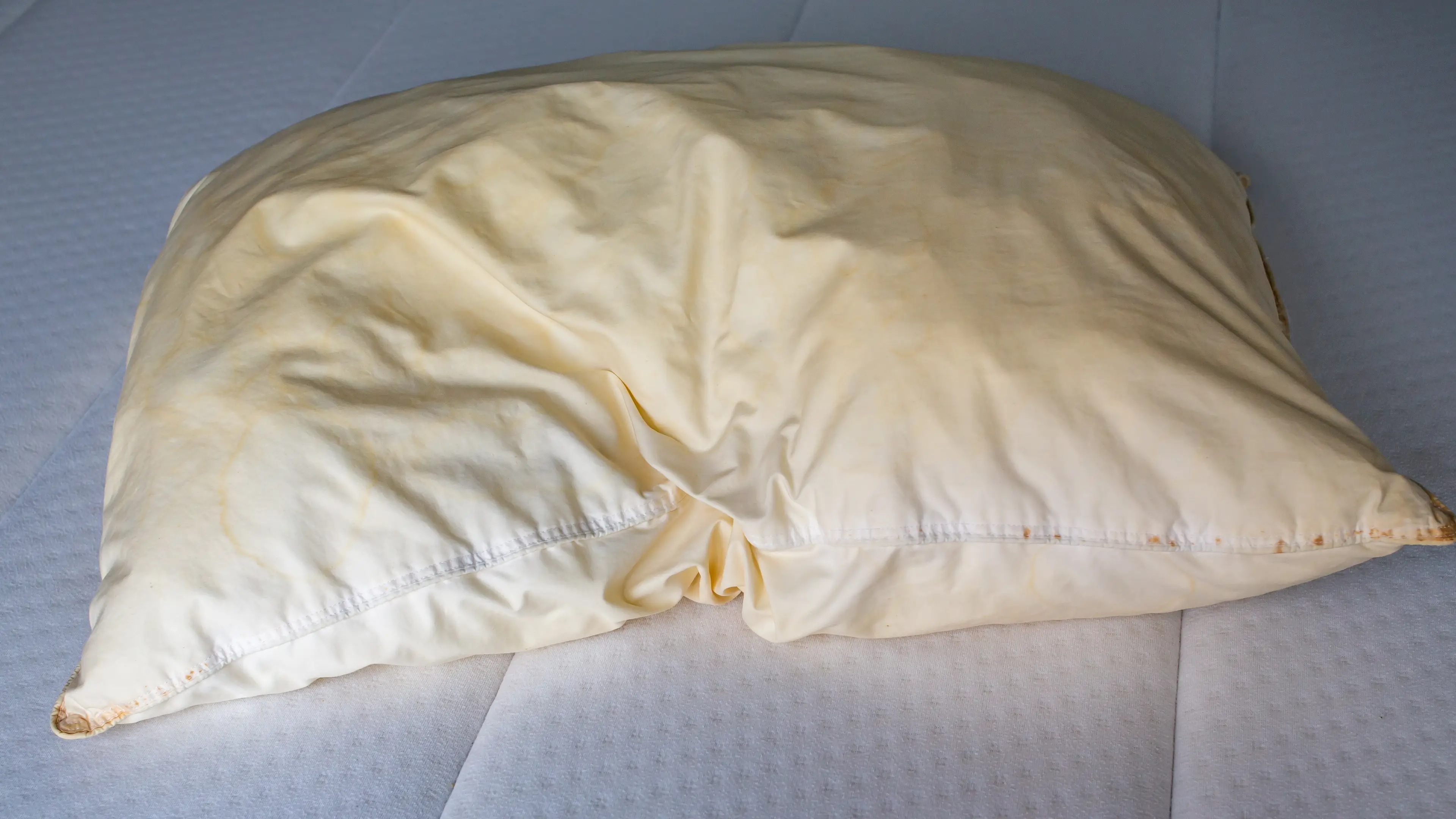
Whether it belongs to you or someone you know, everyone has come across an infamous yellow pillow at some point
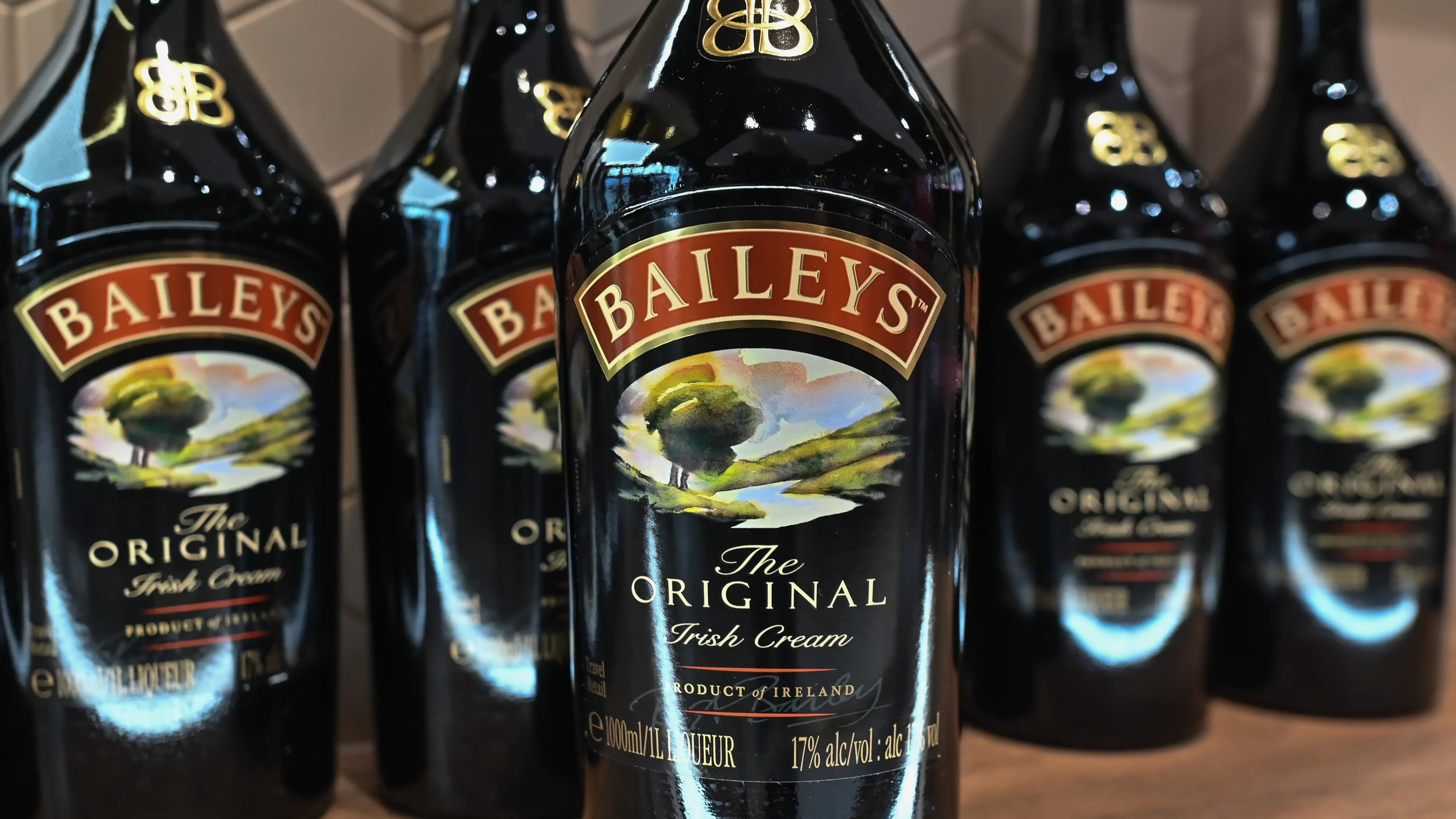
Any Baileys lovers, listen up!

Amazon announced a new tech update for its Ring Doorbell but some people feel uncomfortable.
Many of us may have fallen guilty of this habit following the January blues period...
The television presenter moved following Trump's second election victory

Social media has been left scratching its collective head over these symbols
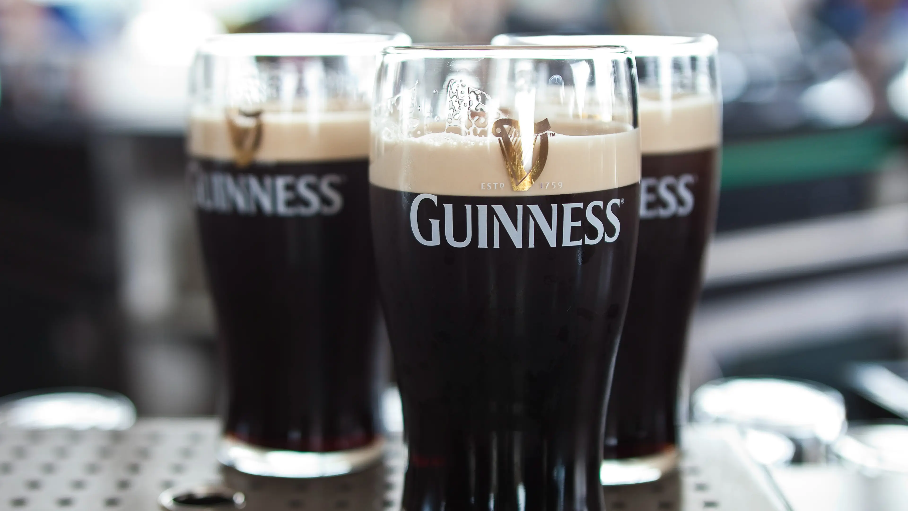
This Irish glass of goodness is an absolute favourite Xmas drink, but you need to be wary
Experts have chimed in to share what you need to stop doing
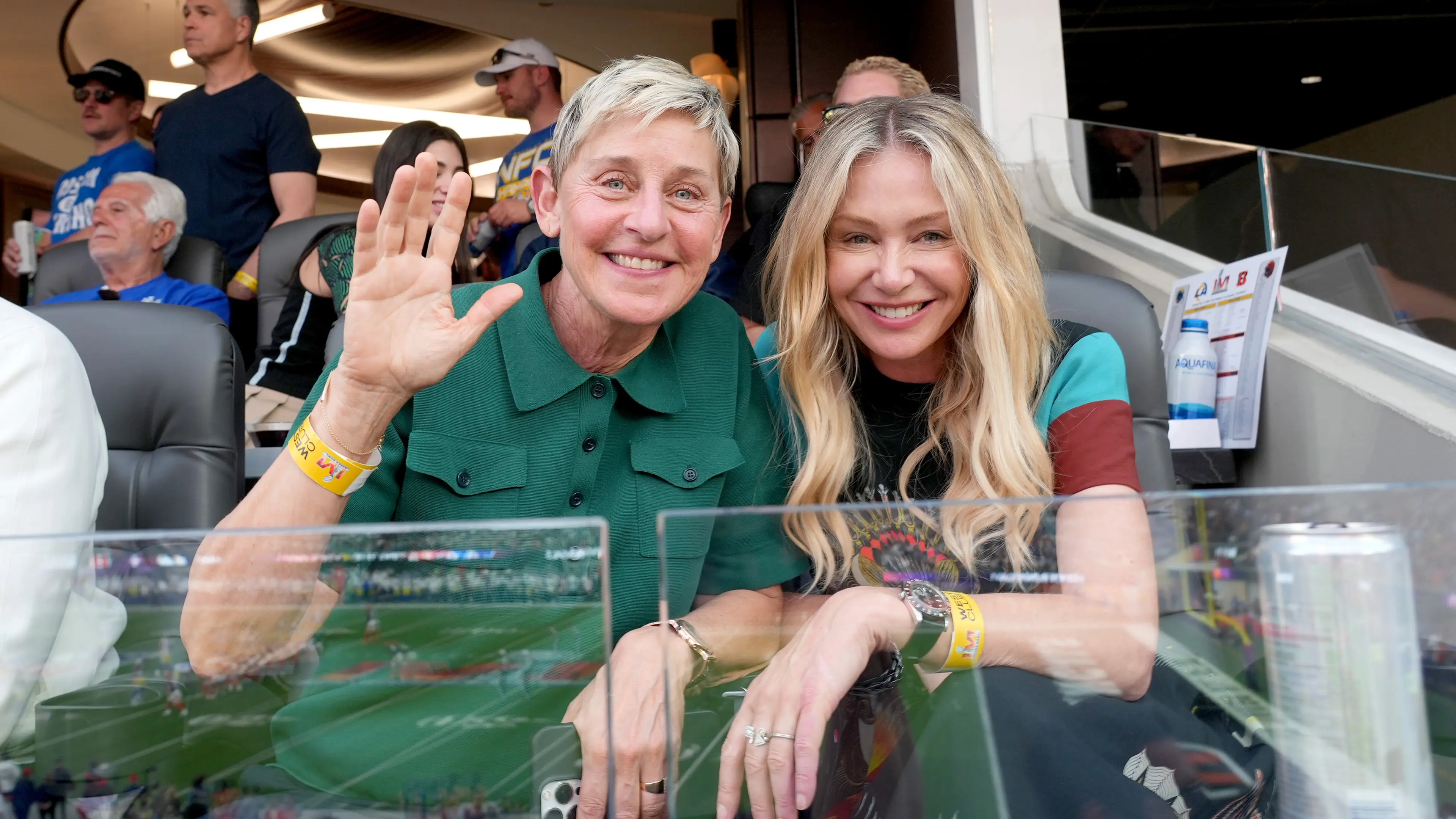
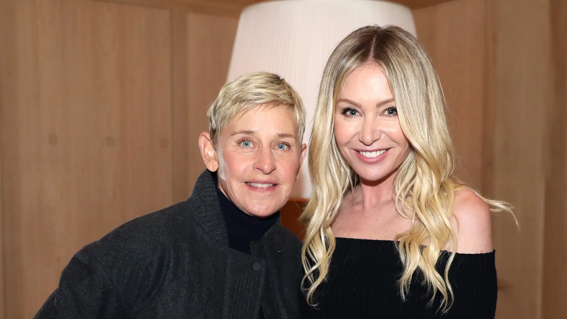
The talk-show host moved to the Cotswolds in Southeast England in November 2024, but reportedly has plans to return to her home-country

The Kardashians star gave fans a home tour on Instagram yesterday (2 December)
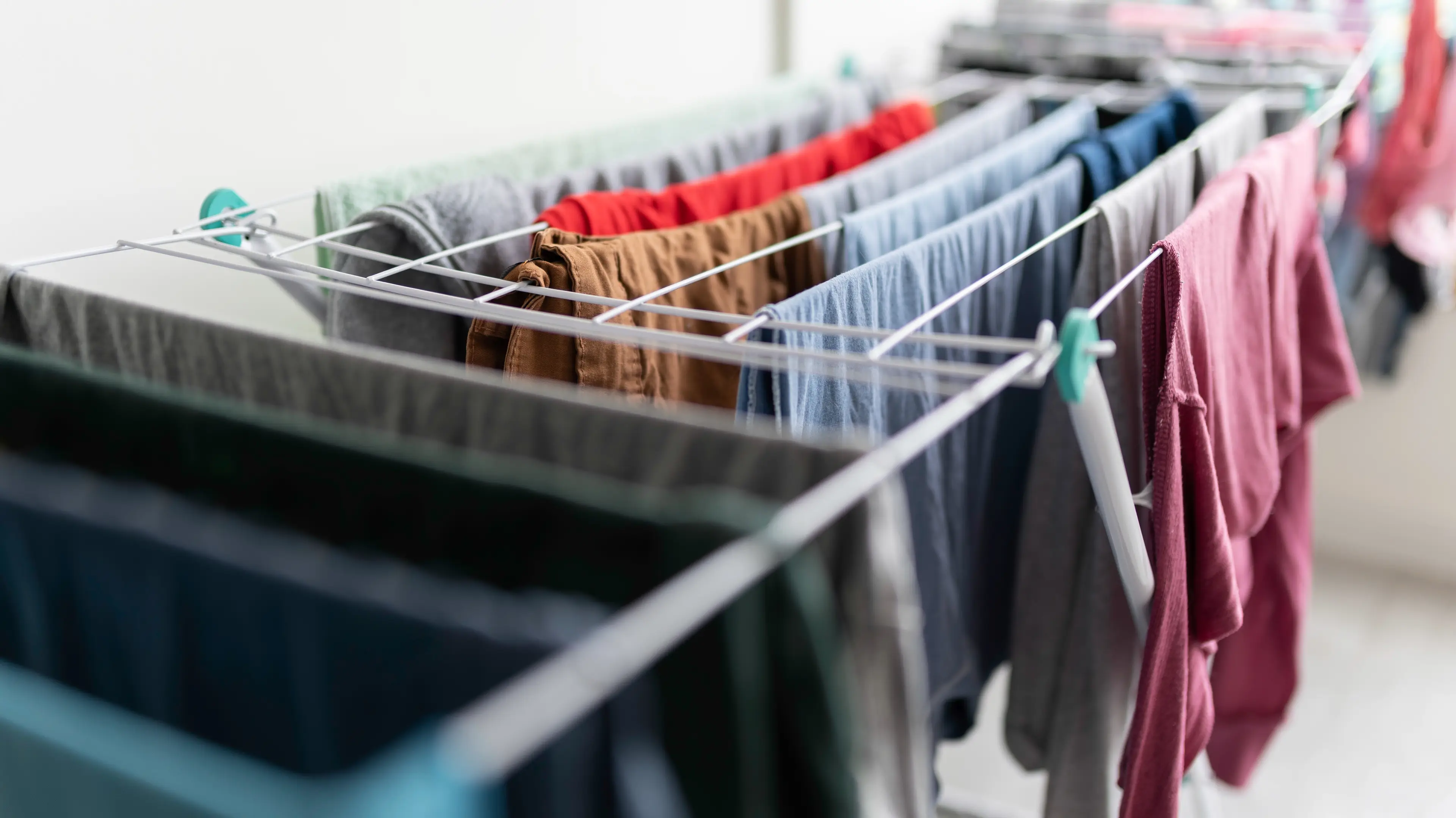
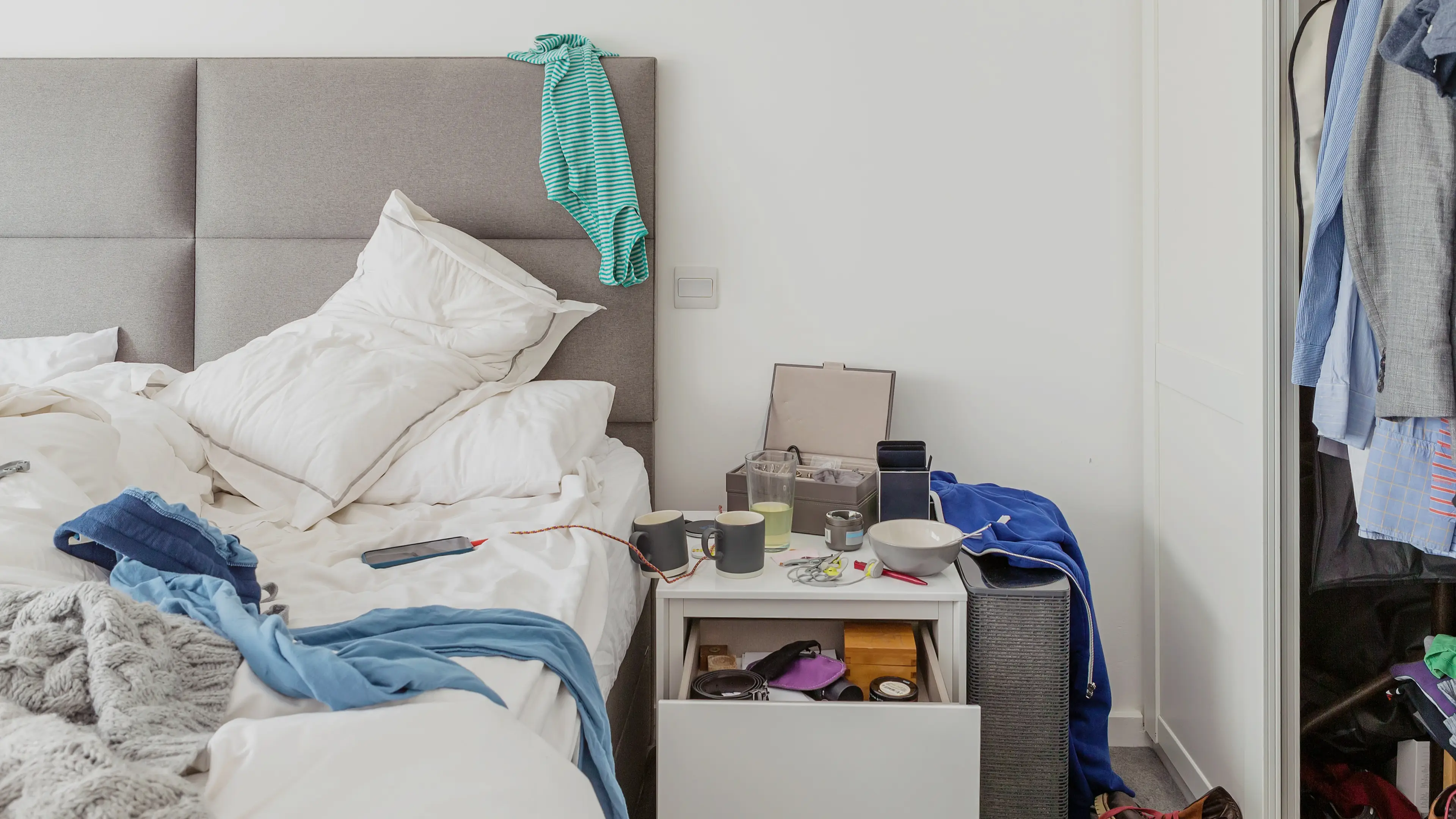
You may want to think twice before you open up that drying rack...

The long-fought legal battle has finally come to an end in Katy's favour

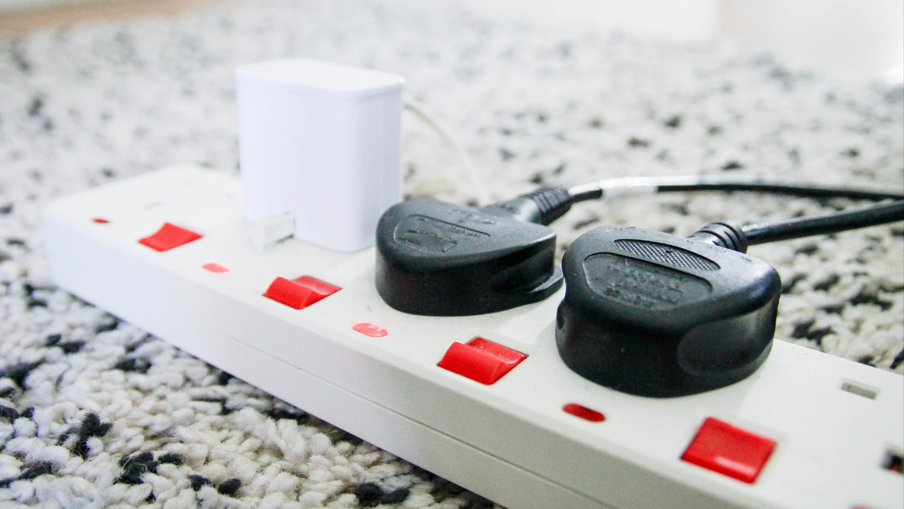
A pharmacist has revealed exactly how the unsanitary habit can impact your health

A mattress expert has shared her tips on using the winter essential during these chilly months

She spoke about how it felt watching the East Wing being demolished on a recent podcast appearance

Apparently, there IS such a thing as being too early for the festive season...

The it-couple wasn't shy in disclosing their peculiar grooming habits

The discriminative cost of being a woman goes SO much further than just the gender pay gap

Kendall Jenner has been modelling since she was just 14
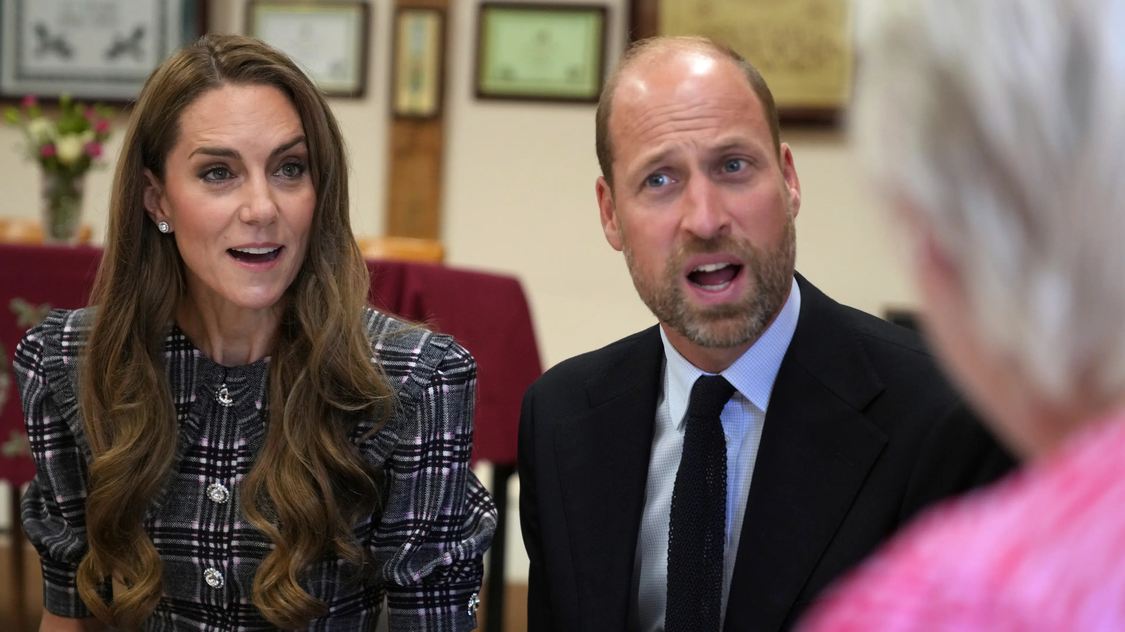
The Prince and Princess of Wales are set to make the move later this year
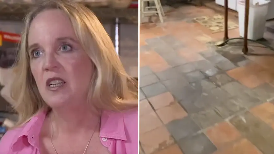
Lynn Rae Wentworth and her husband thought they'd found the home of their dreams, only for it to turn into a nightmare

The royal pair swapped their home at Windsor's Frogmore Cottage for the Californian hills back in 2020