Donald Trump unveils ‘tacky’ Peace Board logo - people notice one detail looks oddly familiar
Topics: Donald Trump, Europe, Politics, Social Media, US News, World News, Gaza
Topics: Donald Trump, Europe, Politics, Social Media, US News, World News, Gaza
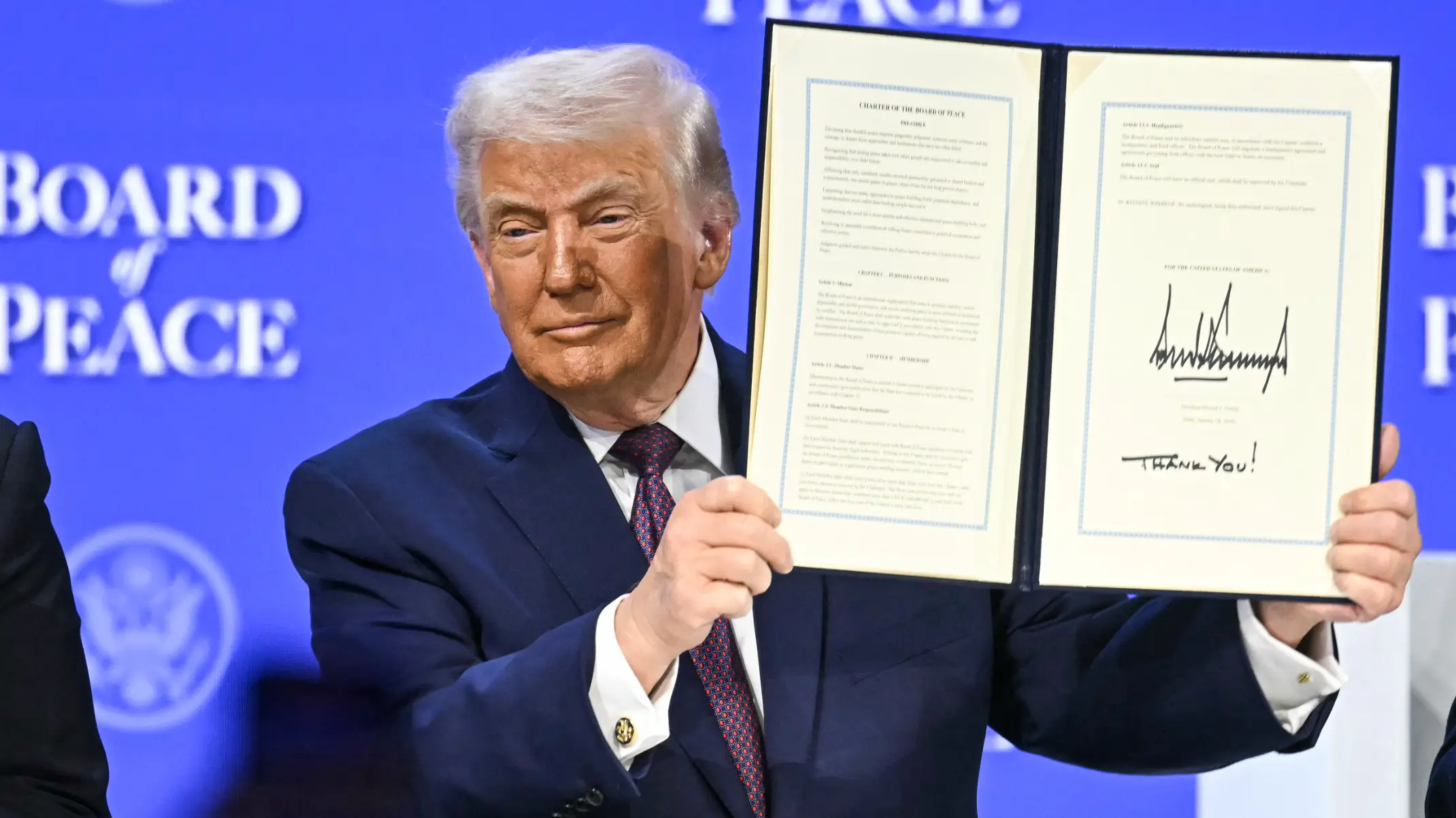
This week, United States President Donald Trump shared more details about his plans for a US-proposed Gaza 'Board of Peace'.
The 79-year-old Republican intends to chair the organisation, which seeks to bring a sustained end to the Israel-Hamas war and is expected to help govern Gaza in the interim and manage its reconstruction.
As of now, no Palestinian names have been included on the senior boards, but Russian President Vladimir Putin has been invited to join, along with his Belarusian counterpart and close ally, Aleksandr Lukashenko. Several other world leaders have responded to the invitations to join the Board of Peace. Morocco's King Mohammed VI and Hungarian Prime Minister Viktor Orban, a Trump ally, have accepted roles on the board.
Other nations, including Albania, Canada, and Uzbekistan, have already indicated they plan to join the venture. They will join Israel, which also publicly confirmed its participation earlier.
Advert
However, it has failed to gain support from a number of European countries, notably the UK, France, Germany, Norway, and Sweden, with UK Prime Minister Keir Starmer calling Putin's role 'concerning'.
Multiple reports state that Trump had asked countries to contribute $1 billion (£745 million) to join the organisation.
He's since unveiled the Board of Peace logo, but people have pointed out the fact that one detail looks oddly familiar to the United Nations logo. The white and gold logo in question features a map of the US front and centre of a globe, so much so that Europe isn't visible in the slightest. Meanwhile, Mexico and parts of the northern part of South America are barely visible.
Similar to the United Nations logo, which is blue and white instead, the Board of Peace logo is framed by olive branches akin to a sports team crest.
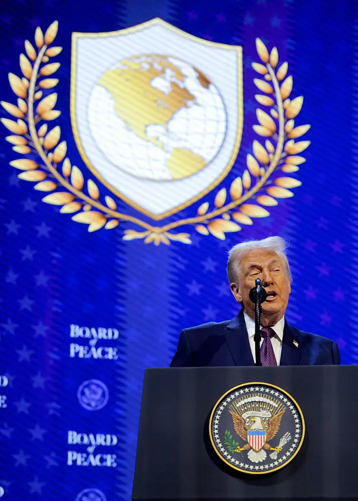
After catching light of the logo, critics rushed to social media to brand it as 'tacky' with one X user writing: "Sheesh, the full-res version of Trump's Board of Peace logo somehow looks even worse. Mixing a clip-art wreath with a pseudo-realistic, geo-textured map is a graphic design atrocity. Big Microsoft Paint energy."
A second slammed: "Beyond parody: Trump's 'Board of Peace' logo is basically the UN logo repainted in tacky fake gold and with 'the world' reduced to only North America."
"Trump’s 'Board of Peace' logo is basically the UN logo, except dipped in gold and edited so the world only includes America," hit out a third.
Another echoed: "Trump’s 'Board of Peace' logo looks like something you unlock in an unlicensed FIFA game called World Soccer Legends or something."
And a final X user added: "Trump’s Board of Peace logo is officially revealed, and the world map appears America-centric and resembles the UN emblem."