Donald Trump’s latest bizarre press conference has got people comparing it to SNL skit
Topics: Donald Trump, US News, Politics, Social Media, Twitter, Money
 Ella Scott
Topics: Donald Trump, US News, Politics, Social Media, Twitter, Money
Social media users were left scratching their heads after US President Donald Trump presented an unexplained chart to journalists in the Oval Office. Without revealing any data or context, the presentation prompted viewers to compare the bizarre exchange to a late-night comedy skit.
Almost 100 Purple Heart recipients were honoured during a ceremony held in the White House East Room on Thursday (August 7) - which recently ruffled feathers over its new gold deco.
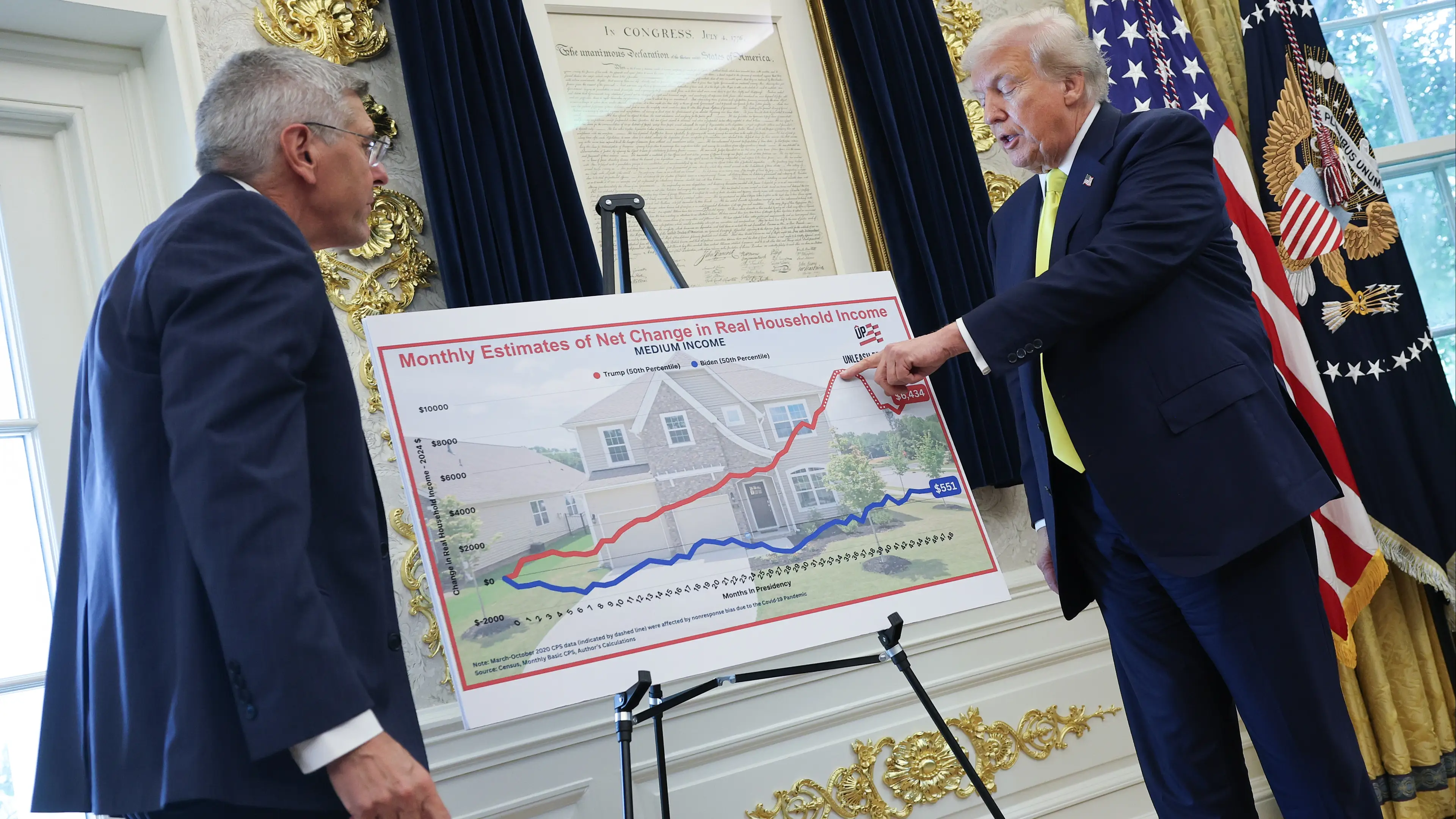
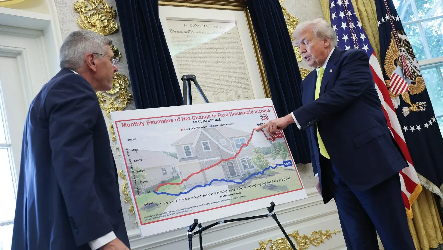
However, the event was derailed by 79-year-old Trump, who ushered journalists into the Oval Office for a quick meeting with Trumponomics author and senior visiting fellow in economics at the Heritage Foundation, Stephen Moore, 65.
The unexpected aside saw the Republican flipping through charts that he alleged detailed a solid US economy.
Advert
This is despite signs of inflation heating up due to Trump’s newly introduced tariffs, and the July jobs report stating that the US payroll grew by just 73,000 in July, below Wall Street estimates, as per the Associated Press.
Trump discussed the graphs, which were reportedly put together by Moore using unpublished Census Bureau data, making them difficult to independently verify.
At one point, the billionaire businessman could be heard saying: “This one chart really says it better than anything, if you look at this. This is great. But this chart is pretty amazing. Right here. All new numbers. Okay?”
The clip of Trump discussing the charts without actually revealing what was on them has gone viral across social media, leading some X users to liken it to a comedy skit.
“Holy cow. This actually looks like an SNL skit,” commented one X user.
“That's an amazing chart - look at how that line is growing up and up and up!,” joked someone else, as a third poked fun at the video by sharing a still from an episode of Always Sunny in Philadelphia.
It showed a Sharpie-drawn graph, highlighting that as profits rise at the fictional Paddy’s Pub, the ‘saturation’ of ‘chicks’ in the building unfortunately falls.
“All jokes aside, this is actually frightening when you really think about it,” someone else replied.
A fifth user echoed: “Is this a Saturday Night Live skit?”
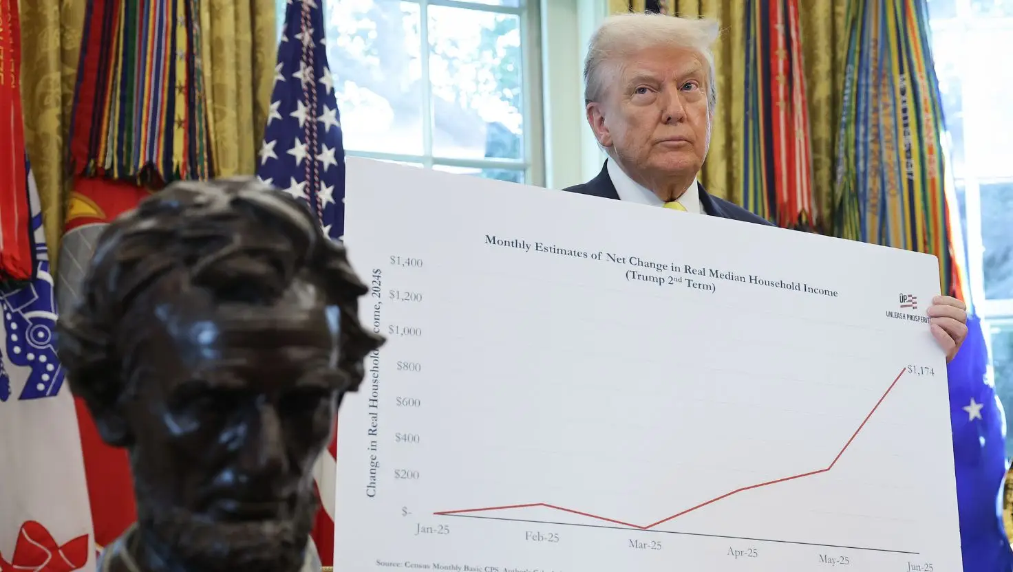
The bar chart Trump was referring to was titled ‘Monthly Estimate of Net Change in Real Median Household Income’.
It allegedly showed that the average median household income adjusted for inflation and for the average family in America is already up from $0 to $1,174 (£873.24) in the first five months of Trump’s second term in office.
“That’s an incredible number,” Trump said. "If I would have said this, nobody would have believed it.”
Trump’s chart exchange comes just days after he revealed he would be donating his presidential salary to charity, making his first paycheck out to the White House Historical Association.
“Great improvements and beautification is taking place at the White House, at levels not seen since its original creation. MAKE AMERICA GREAT AGAIN!,” he wrote on his social media website, Truth Social.
The father-of-five previously donated portions of his $400,000 (£297,564) salary to the National Park Service, the Small Business Administration and the Department of Health and Human Services in his first term in office, as per a White House bulletin.