People Are Just Discovering Starbucks Original NSFW Logo
Topics: Starbucks, Food and Drink
 Gabriella Ferlita
Topics: Starbucks, Food and Drink
People are just discovering that Starbucks had an original NSFW logo - and we’re shook.
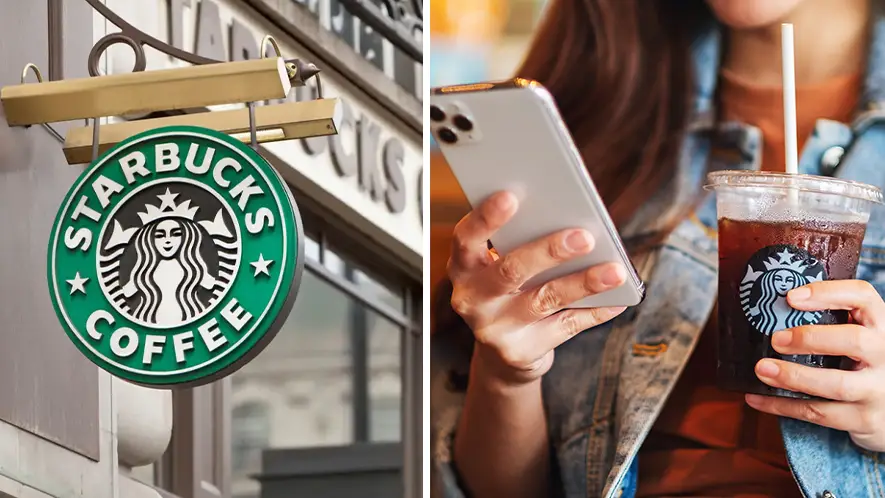
The coffee chain is well-known for its delicious hot, iced and blended beverages and oh-so Instagrammable cups. But did you know that the old logo was a little inappropriate?
Starbucks isn’t one to shy away from a logo change, or two, with customers fondly remembering the former green, black and white circular logo which read ‘STARBUCKS COFFEE’ with two stars on either side, which was launched in 1992.
Advert
Since 2011, however, the brand has opted to showcase a zoomed-in image of its crown-wearing mascot without the use of wording.
Before this, though, the original Starbucks logo was a less than appealing brown print that showcased a zoomed-out image of a topless twin-tailed mermaid - or a Siren in Greek mythology.
Tailor Brands explained how in the 70s, the company was originally called ‘Pequod’, which is based on the ship in the Moby-Dick novel of the same name.
Aware that ‘Pequod’ wasn’t the catchiest of names, the founders decided to call their brand Starbuck instead, the name of the ship’s chief mate.
Their first logo design was in keeping with their already established navel theme, depicting a mermaid in the logo. These creatures, specifically, would entice sailors into crashing their ships onto islands, with the idea of the Starbucks logo instead enticing potential customers into buying coffee there, Tailor Brands explained.
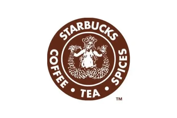
Meanwhile, the brown palette symbolised ‘earthly, stable and nurturing” themes as the mermaid held her tail in both hands.
The company name was written around the circle, while “coffee, tea and spices” was written around the mythical creature to describe what Starbucks sells.
The more you know!