Starbucks Changed Its Logo Without Anyone Noticing
Topics: Starbucks
Topics: Starbucks
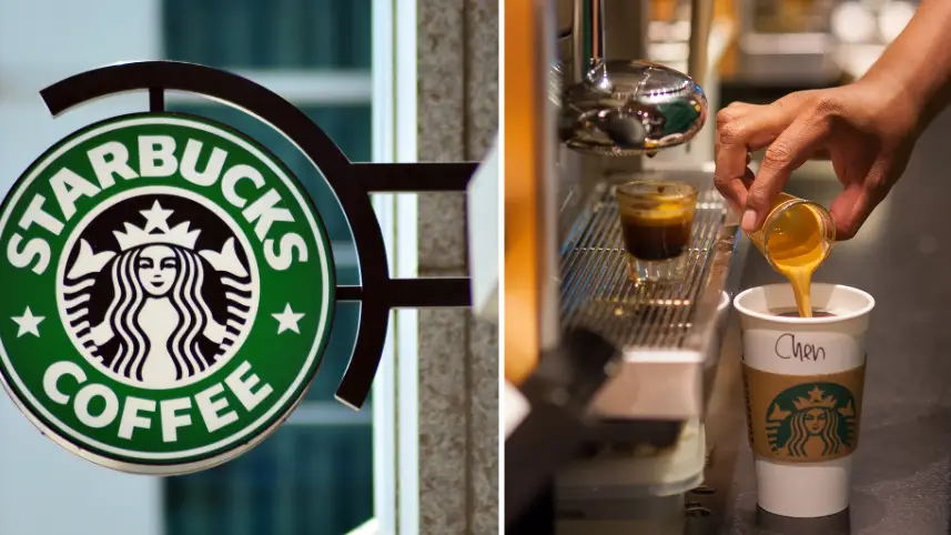
Starbucks undoubtedly has one of the most recognisable logos in the world.
Who wouldn't look at that specific shade of green and graphic mermaid tail and instantly be reminded of their much-adored caramel frappuccino?
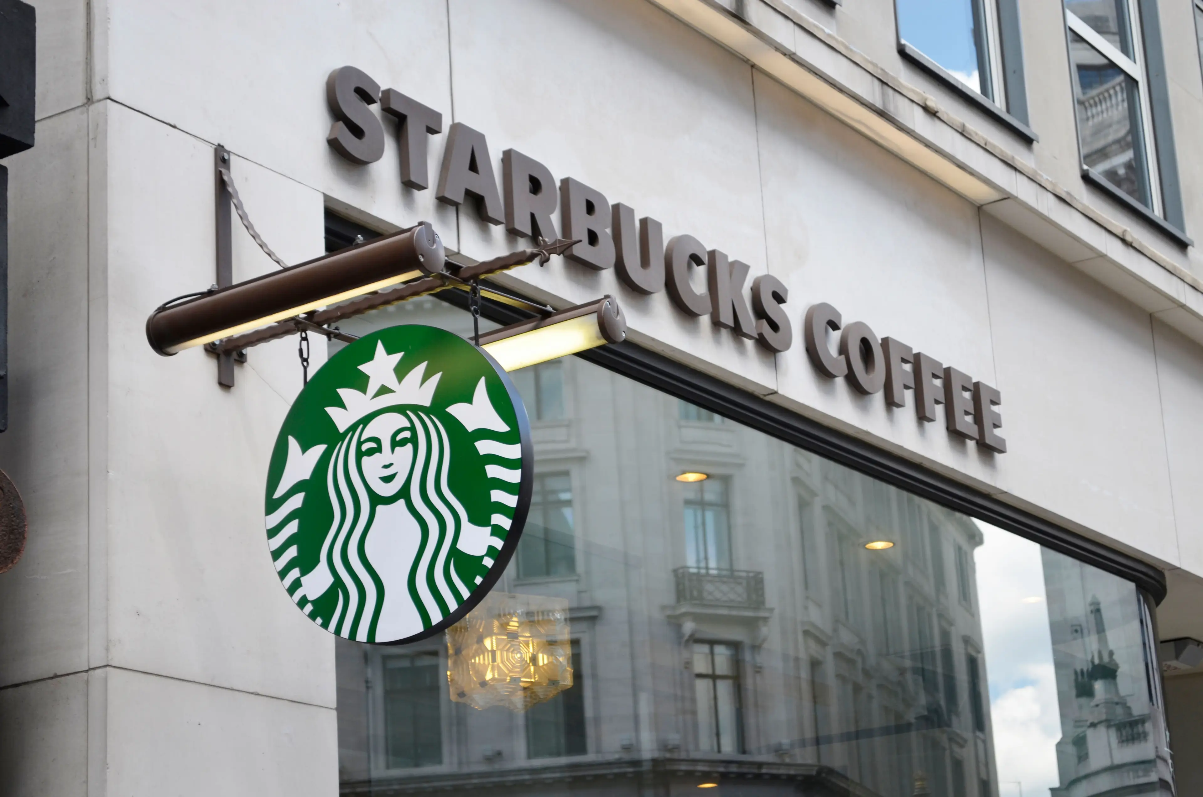
But the logo we all know and love today didn't always look that. After going through something of a makeover back in 2011, following the coffee chain's 40th anniversary, the brand opted for a little bit of a redesign.
You can see it here:
Advert
Going for a more simplistic and eye-grabbing look, the Starbucks logo knocked out the "Starbucks Coffee" text from its emblem and used the extra space to enlarge the image of the mermaid.
As well as this, the company chose to colour the entire logo in its go-to shade of green - making a huge difference compared to the pre-2011 logo when the mermaid's background was once black.
All in an attempt to simplify and brighten the logo, the company has clearly succeeded and many of its avid coffee-drinkers approve of the shift in design.
Advert
However, some Starbucks fans weren't too happy with the company's effort to rebrand.
In a viral Instagram video captioned, "What in the mandela effect?", we can see how four well-known companies have adapted their branding over the years, one of which included Starbucks.
"Most of them looked better than the new ones," one Instagram user commented.
Advert
Another user echoed this comment, "All the OGs are best".
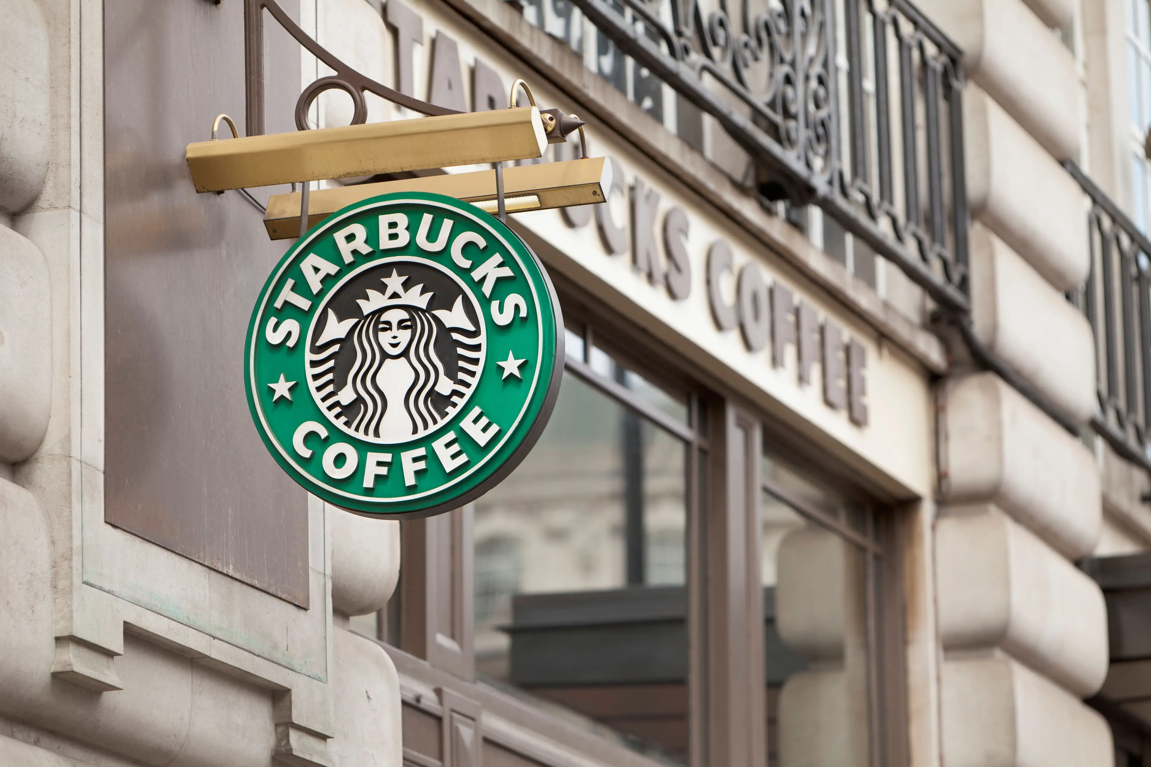
A third even referenced the original logo from way back in the 1970s and chimed in with, "Starbucks actually had boobs originally..."
But, even with all the logo changes it's clear that one thing is for certain - the famous mermaid illustration has remained a starring role in the logo and has truly stood the test of time.
Advert
In another 40 years time, who knows what the newest Starbucks logo will end up looking like?