Burger King is starting 2021 by reinventing itself. The fast food chain has debut a trippy new logo which has social media collectively losing their minds.
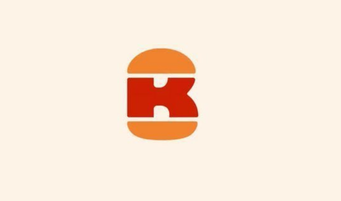
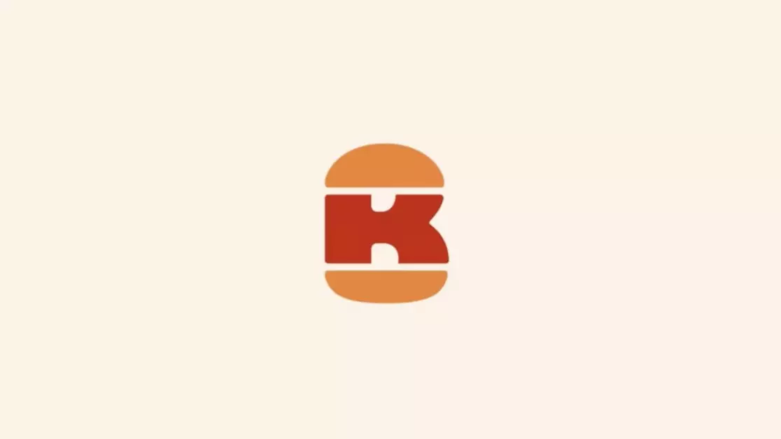
The new logo does exactly what a real burger does - stacks lots of ingredients on top of one another to create something spectacular. It is essentially in the shape of a burger, with a large 'K' (for 'King' of course) sandwiched between two orange buns.
But wait, there's more! If you look closely the curvature of the buns and the 'K', it creates the shape of a 'B'.
Advert
Not only is the new Burger King monogram logo a burger, it also contains the restaurant's initials.
Genius.
"This rebranding by Burger King is trippy and amazing," said one social media user.
They added: "See the K. See the Burger. Now see the B," with the mind-blown emoji.
Advert
Another person said: "Whoever designed the new Burger King logo should be allowed to design EVERYONE'S logo. Absolutely stunning bit of design. *wild applause*"
One woman said: "Can't help but to love the new Burger King lettering on their products. Fun and retro. Quite fancy a Melty Juicy now."
Advert
"The new Burger King logo is a B and a K and a burger AT THE SAME TIME," added another Twitter user.
However, not everyone loved the throwback look, with some deeming it unimaginative.
Advert
"Someone got paid big bucks for that," said one tweeter disparagingly.
"Is it just me, or have almost ALL 'modern' logos just been retro refreshes?" commented another.
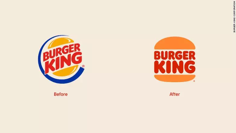
The new logo was designed by Jones Knowles Ritchie, and is inspired by the original Burger King logo which featured the entire restaurant name in red and enclosed by two yellow-orange buns.
The design studio posted about their inspiration for the redesign, the message reads: "For Burger King's first global rebrand in more than two decades, we set out to make the brand feel less synthetic and artificial, and more real, crave-able and tasty.
Advert
"We were inspired by the brand's original logo and how it has grown to have an iconic place in culture. The new logo pays homage to the brand's heritage with a refined design that's confident, simple and fun."
And for all you font enthusiasts out there, the new font is called Flame Sans!
Since 1999, the logo has had a more modern look, with a dynamic font and a blue crescent around the burger logo.
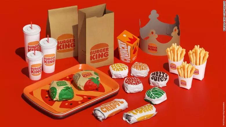
Burger King appears to be returning to its retro, hippy-ish font across all its products and marketing material, with bold and pale orange and red shades.
Who doesn't love a throwback?!
Featured Image Credit: Burger KingTopics: Food And Drink, Tasty