
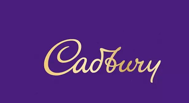
Cadbury has unveiled its first new logo in 50 years, along with revamped packaging for its iconic Dairy Milk chocolate bar - and it's fair to say reaction has been mixed.
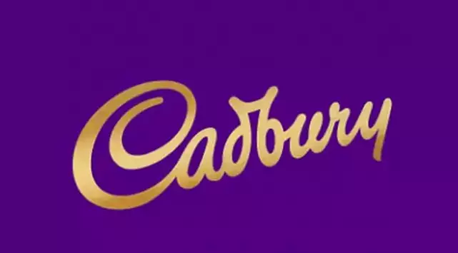
Since 1921, the chocolate giant's logo has been based on the signature of William Cadbury, the grandson of its founder John, who launched the company in 1824.
Advert
The new logo signals the first major update to the chocolate company's branding in five decades - but don't get too excited if you were expecting something entirely different.
Cadbury's new logo is said to be based more closely on William's signature, using finer lettering (including a newly looped 'b') and getting rid of its signature slant - but it's fair to say it's not a drastic change.
Advert
A spokesperson from the company said it wanted to make the design feel more modern.
"The revitalisation of the Cadbury wordmark drew inspiration from the hand of founder John Cadbury himself to create a beautifully crafted signature with a more contemporary feel," they said in a statement.
The brand also responded to online rumours that the subtle rebranding cost the company £1million.
"The Cadbury logo redesign is part of a much wider brand refresh which began over a year ago and touches all Cadbury visual assets," the brand wrote on Twitter, adding: "The cost of this work to the UK market was nowhere near the £1 million figure that has recently been suggested and reported."
Advert
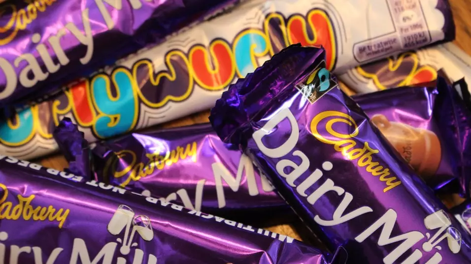
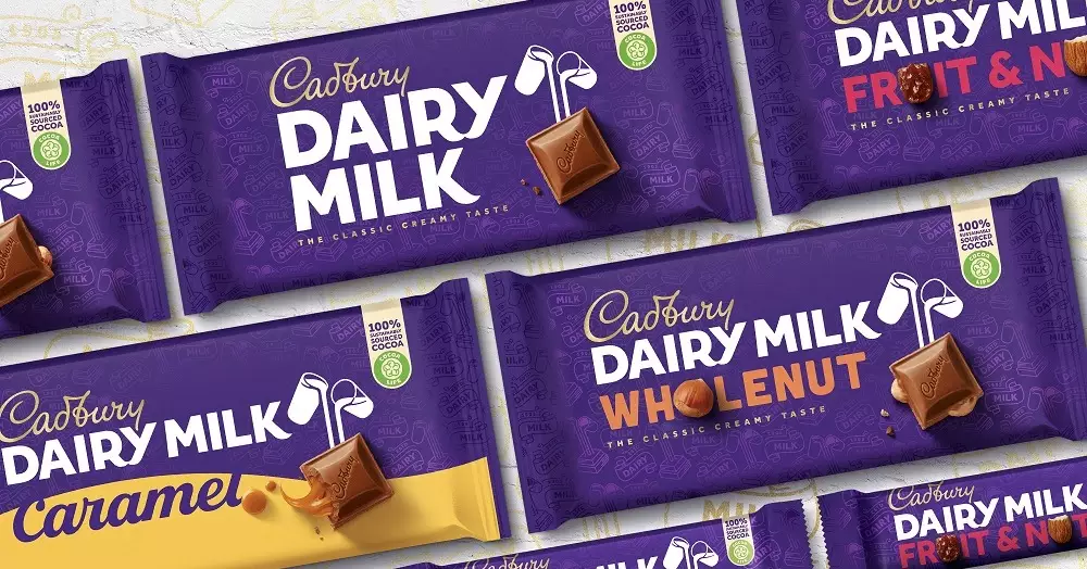
Meanwhile, the Dairy Milk chocolate bar has also been given a revamp, with a simpler font and a new look for its famous glass-and-a-half motif.
The new packaging will be rolled out in Australia next month, before reaching the UK in early 2021.
As for the reaction to the new logo online, it's certainly been mixed. "So the logo basically lost weight," tweeted one person.
Advert
Another added: "So Cadbury's new logo change is the most pointless thing I've seen in my entire life."
A few people pointed out that the 'u' and 'r' read a bit like 'w' making it 'Cadbwy' - and and now we can't unsee it.
Thanks for that.
Featured Image Credit: PixabayTopics: Tasty Food, Cadbury, Food And Drink