
It’s not something we’ve really spent time thinking about – but have you ever had a good look at the Travelodge logo.
For years, we’ve just assumed the logo for the budget hotel was an amber sky of a rising sun and blue, rolling hills – perhaps symbolising new beginnings, or a journey?
Well, it turns out it’s not that deep at all.
Advert
Watch the video below and prepare to have your mind blown.
TikTok user @chxrll took to the video sharing platform to share her sudden revelation about the Travelodge logo.
“My dumb ass thinking about how the Travelodge logo is a person sleeping…” she wrote, as she chows down on crisps.
Advert
“For years I thought it was hills!”
Wait…what?
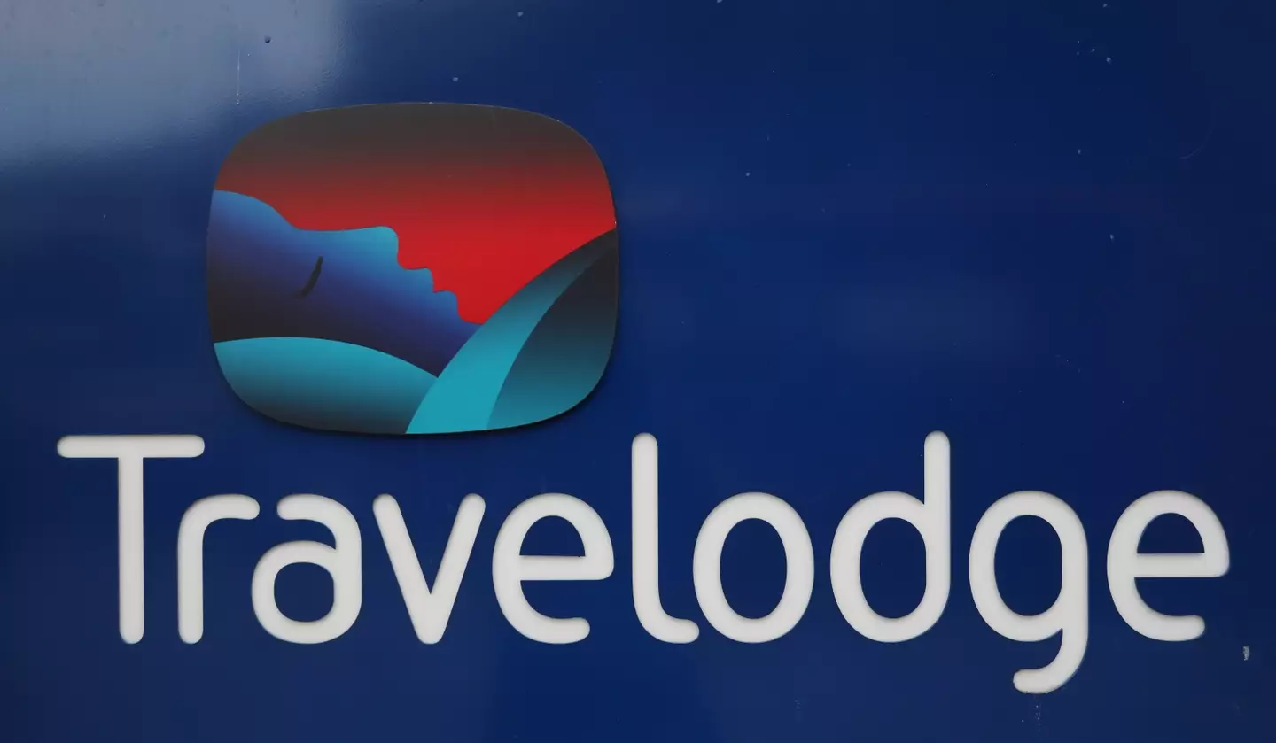
Yep, if you look closely, the Travelodge logo is someone enjoying a good night’s sleep, tucked in under a duvet.
Advert
We can’t believe it either.
And neither can the 661,000 people who have since watched @chxrll’s comments in shock.
“S***, I thought it was a seagull!” said one bewildered viewer.
“I’ve never seen that before in all my life, I thought it was just colours!” said a second.
Advert
Even people who are employed at the hotel are baffled. “OMFG I worked for Travelodge and I never even realised!” a third person added.
“I was today years old when I learned this,” chipped in a fourth.
However, some of us have always seen the Travelodge logo for what it is.
Advert
“Am I the only person who has always known it was a person sleeping?” a fifth person said.
It seems as if they are, as everyone else is in awe.
But it turns out, we’re not entirely wrong in thinking the logo looks like hills, as one particularly marketing-minded person explained: “It’s both. It’s supposed to be like, ‘home away from home’ as if to say ‘after the travelled roads, you sleep well here.’
“It’s quite clever, really.”
Quite.
Tyia has contacted Travelodge for comment.
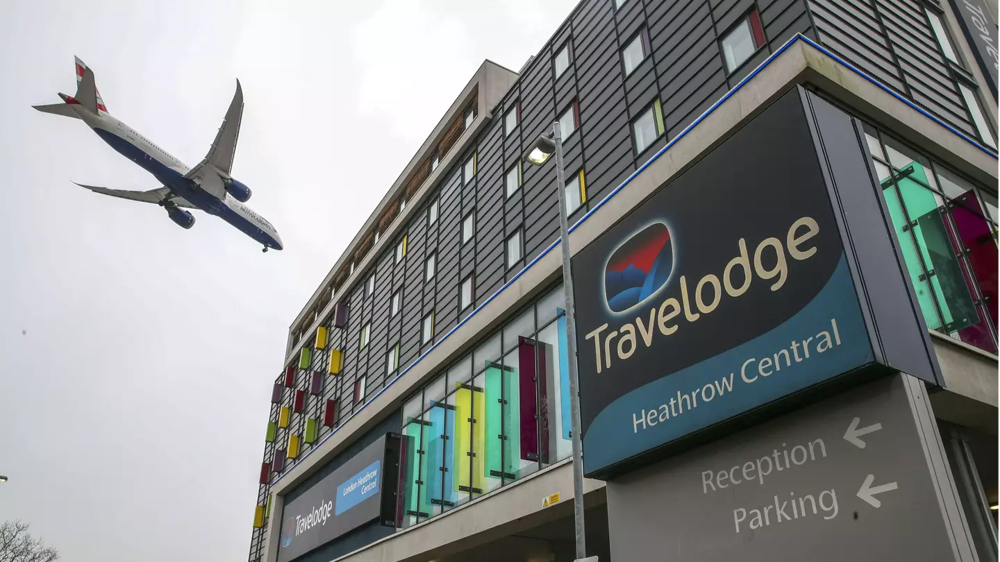
Featured Image Credit: PA